5 Pro Tips for Creating Hoodie Mockups That Sell
Hoodies are one of the highest-margin products in streetwear. But the difference between a hoodie that sells out and one that sits in inventory often comes down to presentation. Your customers cannot feel the fabric weight or check the fit in person — your mockup has to do that job for them.
Here are five proven techniques for creating hoodie mockups that convert browsers into buyers, based on what actually works for successful apparel brands.
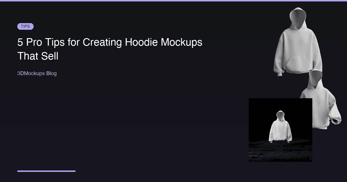
Tip 1: Show the Full Silhouette
Hoodies have a distinctive shape that sets them apart from every other garment. The hood itself, the kangaroo pocket, the ribbed cuffs and hem, the drawstrings — these details define the hoodie category. Your mockup should capture all of them clearly.
A common mistake is using a mockup that crops out the bottom of the hoodie or hides the hood behind the garment. Customers want to see the full silhouette because it communicates the fit and style. An oversized hoodie has a fundamentally different silhouette than a fitted one, and that difference should be immediately obvious in your mockup.
The walking hoodie models in 3DMockups are particularly effective because they show natural fabric movement. When a hoodie is in motion, you can see how the fabric weight affects the drape, how the hood sits, and how the pocket hangs. This dynamic view gives customers a much better sense of how the hoodie actually looks when worn compared to a static front-facing shot.
Use multiple silhouette views for your product listing. A front view shows the main design. A slight three-quarter rotation shows depth and fit. A back view shows the full garment shape. Together, these three angles give the customer a complete mental picture of the product.
Tip 2: Get the Color Right
Hoodie fabric absorbs and reflects light differently than t-shirt fabric because of its heavier weight. A cotton fleece hoodie has deeper shadows in the folds and more pronounced highlights on the raised areas. When setting up your mockup, color accuracy matters more than you might think:
- Use the exact color code from your manufacturer. If they give you a Pantone reference or hex value, use that specific color in the mockup. Even small differences between the mockup and the real product lead to customer complaints and returns.
- Check how your design looks on both light and dark base colors. A design that pops on a black hoodie might disappear on a navy one. The 3D preview lets you switch colors instantly, so test every colorway you plan to sell.
- Remember that 3D rendering preserves fabric texture. Use this to your advantage. The realistic shadows and highlights in a 3D mockup communicate fabric quality in a way that flat mockups cannot.
- Account for print method differences. Screen printing on a dark hoodie uses an underbase layer that affects opacity. Direct-to-garment printing has a different texture on heavyweight fleece. While you cannot simulate every print method perfectly, choosing the right garment color ensures the overall impression matches the real product.
Spend extra time on color matching for your best-selling colorways. If 60 percent of your hoodie sales are the black version, make sure that black mockup is perfect.
Tip 3: Scale Your Graphics Appropriately
The most common mistake in hoodie design is graphics that are too small. Hoodies have a larger printable area than t-shirts, especially oversized styles. A chest print that looks great on a regular t-shirt will look lost on a hoodie front.
Use the 3D preview to check these critical questions:
- Does the design fill the intended space? A center chest graphic on a hoodie should be larger than the same graphic on a t-shirt. The extra fabric real estate demands a proportionally larger print.
- Is text readable from a normal viewing distance? On a hoodie, normal viewing distance means about four to six feet. If your text is too small, it becomes a blur. Open your mockup on your phone at arm's length — if you cannot read the text, your customers cannot either.
- Does the graphic work with the kangaroo pocket placement? The pocket creates a horizontal line across the lower front of the hoodie. If your design extends into that area, check that it does not get visually cut off or compete with the pocket seam.
- How does the design interact with the hood drawstrings? Drawstrings hang in front of the upper chest area. Make sure your design does not place critical elements where drawstrings would cover them in real life.
A good rule of thumb: if your design looks slightly larger than you think it should be in the mockup, it is probably the right size.
Tip 4: Use Multiple Settings and Contexts
Do not rely on a single mockup for your entire marketing funnel. Different contexts serve different purposes, and each stage of the customer journey benefits from a specific type of mockup:
- Front-facing on neutral background — your product page hero image. This is the clean, professional shot that appears in search results and product catalogs. Keep it simple and let the design speak.
- Walking pose — social media and advertising content. The dynamic movement catches attention in scrolling feeds and communicates lifestyle. The walking hoodie models are some of the most engaging content formats for apparel brands on Instagram and TikTok.
- Rock and outdoor setting — lifestyle content for brand storytelling. These mockups work well for lookbooks, seasonal campaigns, and any context where you want to communicate the brand aesthetic beyond just the product.
- Detail shot — close-up views that showcase print quality. Use these for carousel slides, product page secondary images, and any context where customers want to examine the details.
Each setting tells a different part of the story and appeals to different customer mindsets. Someone browsing Instagram wants to be inspired. Someone on your product page wants to evaluate. Someone reading a review wants to see details. Create mockups for each mindset.
Consider creating a consistent set of mockups for every hoodie in your collection: one hero shot, one lifestyle shot, one detail shot, and one animated loop. This library approach saves time and ensures visual consistency.
Tip 5: Create Video Content
Static images are table stakes in 2026. Every brand has decent product photos now. To stand out in a crowded market, you need motion:
- Rotating 3D views let customers examine the hoodie from every angle without clicking through a gallery. A smooth rotation loop communicates premium quality through the viewing experience itself.
- Walking animations add lifestyle context that static images cannot match. Seeing a hoodie in motion — how the fabric swings, how the hood bounces, how the pocket hangs — gives customers a visceral sense of the product.
- Short loops are perfect for Instagram Reels and TikTok. A three-to-five second loop of a walking hoodie with your design is more engaging than any static carousel. The algorithm favors video content, so animated mockups get more organic reach.
- Before and after reveals — show the blank hoodie, then cut to the design applied. This simple format is effective on TikTok and communicates the design process in a relatable way.
3DMockups supports 60fps MP4 exports on the Pro plan. Turn every hoodie design into scroll-stopping content without hiring a videographer or renting a studio.
Bonus: Hoodie-Specific Design Considerations
Beyond mockup technique, there are design principles specific to hoodies that affect how your mockup looks:
Print placement zones: The standard hoodie print zones are center chest, full front, left chest, and back. Some brands also print on the hood itself or down the sleeves. Your mockup should accurately represent the intended print zone.
Color psychology: Black and gray hoodies dominate streetwear because they communicate versatility and edge. But do not overlook the impact of unexpected colors — a well-designed hoodie in a unique colorway stands out in a feed full of black hoodies.
Seasonal context: If you are launching a winter collection, your mockup context should reflect that season. The rock and outdoor settings communicate a cold-weather vibe that reinforces the practical value of the hoodie.
The Bottom Line
Measuring Mockup Performance
Creating great mockups is only half the equation. You also need to measure whether they are working. Here are the key metrics to track:
Conversion rate by product image — if your e-commerce platform supports A/B testing, test different mockup styles against each other. You may find that walking-pose mockups convert better than static ones for certain products.
Click-through rate on social media — track which mockup styles generate the most engagement. Dynamic poses typically outperform static shots, but your specific audience may have different preferences.
Return rate correlation — compare return rates between products with high-quality 3D mockups and those with simpler imagery. A decrease in returns validates that your mockups are setting accurate expectations.
Time on product page — customers who spend more time examining product images are more engaged buyers. Multiple angles and high-quality mockups increase dwell time.
Use these metrics to continuously refine your mockup strategy. What works for one brand or product category may not work for another, so let the data guide your decisions.
The Bottom Line
Your hoodie mockups are your digital storefront. In a market where customers make purchase decisions in seconds based on product imagery, the quality of your mockups directly impacts your revenue. Invest the extra minutes to get the silhouette right, nail the color, scale the graphics properly, create multiple contexts, and add motion. You will see it reflected in your conversion rates and your bottom line.
Ready to create your first mockup?
Try 3DMockups Free